
The Role of Color in Branding and Consumer Perception
How Ribbon Colors Reinforce Brand Identity
Label ribbons act like quick signals for what a brand stands for. Studies show around 78 percent of people remember brands better when they stick to the same colors throughout their products according to PandH research from last year. Companies that work with specialized foil suppliers for exact color matches get much better results. These experts help reproduce colors just right so customers instantly recognize them on everything from product boxes to store displays. Take one health-focused business that saw a boost in how strongly people connected with their brand after switching to a distinctive teal ribbon for all their packaging over three marketing periods. The connection jumped by about 41% during this time.
Psychological Effects of Colors in Promotional Design
Products wrapped in warm colored ribbons like reds and oranges tend to feel about 34% more exciting than those with cooler colors on average. Meanwhile, blue and green ribbons seem to build trust, especially when it comes to products related to health or wellness. A recent study from the Material Perception Report shows interesting trends too. People who see items with metallic gold ribbons automatically think they're higher quality stuff, and are often okay paying around 28% extra for these luxury goods in stores. That kind of pricing power speaks volumes about what color choices can do for brand perception.
| Color Family | Consumer Perception | Common Industry Use |
|---|---|---|
| Earth Tones | Organic/Eco-Friendly | Sustainable Brands |
| Jewel Tones | Luxury/Exclusivity | High-End Retail |
| Pastels | Approachability | Childcare Products |
Consumer Perception and Color Association with Products
Consumers process ribbon colors faster than text-based branding elements—neuromarketing research from 2023 shows color is recognized 12% quicker than words. This speed explains why 63% of gourmet food brands use forest-green ribbons to signal artisanal quality, while tech firms favor electric blue to convey innovation.
Emotional Responses Triggered by Different Ribbon Hues
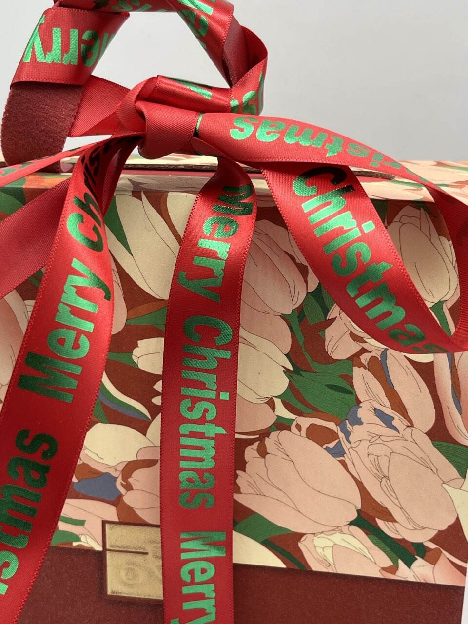
The way we react to colors is deeply rooted in our cultural conditioning. Take red ribbons for instance they can actually raise heart rates by about 15% according to research from PandH last year, which explains why brands use them so much for special edition products. On the flip side, those soft green ribbons seem to work wonders in service sectors, cutting down how long people think they're waiting by roughly 22%. When companies pick their colors carefully, it's not just random choice but part of something bigger called chromatic branding. The right shades can stir specific feelings in customers, creating connections that keep folks coming back again and again.
Aligning Ribbon Colors with Brand Identity Guidelines
Practical Label Design Tips for Cohesive Branding
Brand consistency boosts revenue potential by 33% (UpwardEngine 2024) by reinforcing visual recall. To maintain coherence:
- Match PMS/HEX codes from brand guidelines to ribbon production batches
- Use monochromatic schemes for minimalist brands or complementary hues for dynamic packaging
- Test finishes—glossy satin versus matte cotton—under actual store lighting to ensure color fidelity
Using Custom Printed Ribbons to Maintain Visual Consistency
Leading manufacturers now offer digital color-matching systems that achieve 98% Pantone accuracy on ribbons. Partnering with a coding foil exporter delivers key advantages:
| Advantage | Technical Benefit |
|---|---|
| Fade resistance | UV-stable dyes lasting 5+ years outdoors |
| Tactile branding | Embossed logos with 0.2mm depth precision |
| Operational efficiency | 15% faster production via automated color calibration |
Case Study: Successful Brands Using Strategic Ribbon Color Selection
A luxury cosmetics company increased unboxing social shares by 40% after aligning ribbon colors with its signature fragrance notes—amber ribbons for oriental scents, aqua for fresh tones. Their brand recognition score rose 22 points in Nielsen’s 2023 packaging study through disciplined color application across 37 SKUs.
Cultural and Industry Considerations in Ribbon Color Selection
Color Ribbon Meanings and Associations Across Cultures
The meaning behind colors changes a lot around the world. Take red for example it brings good fortune in Chinese culture but acts as a warning sign throughout Europe. Purple tells a different story too it's associated with luxury in Western countries yet linked to mourning traditions in some South American regions. White presents another interesting contrast representing purity at Western wedding ceremonies while symbolizing grief in many East Asian communities according to recent studies on cross cultural design practices from MH Chine in 2023. Companies looking to reach customers globally really need to understand these local color meanings before launching products overseas otherwise they risk creating unintended messages that clash with local customs and beliefs.
Industry Paradox: When Popular Colors Don’t Align with Target Demographics
Forty one percent of luxury brands still go crazy for gold accents because they want that premium look, but here's the twist: just twelve percent of Gen Z folks actually think gold equals quality these days. Most young people are all about those clean, simple gray metals instead. There's definitely something wrong when what looks good on paper doesn't match what sells in reality. Marketing teams sitting in their boardrooms picking out colors might be missing the mark big time. Younger customers aren't biting, and neither are professionals working in fields where flashy stuff gets in the way, like hospitals or tech startups where understated design matters more than bling.
Trends in Color Application for Product Labeling and Packaging
The market is really moving toward ribbons that do double duty these days, making the unboxing moment something special while also telling customers what kind of brand they're dealing with. We see lots of satin ribbons in beauty packages with those pretty ombre gradients that look so handcrafted. Meanwhile, there's been a big push lately for matte finish ribbons made from recycled materials, especially among shoppers who care about sustainability. According to a recent industry snapshot from 2024, nearly two thirds of high end brands have started focusing on ribbons that can stand up to different weather conditions. Most of them get this durability by working closely with suppliers who specialize in coding foils that keep colors looking fresh even after exposure to sunlight or moisture.
Customizing Promotional Labels with Durable Colored Ribbons
Branded Merchandise for Promotional Campaigns Using Colored Ribbons
Colored ribbons transform promotional labels into memorable brand touchpoints. With 89% of consumers (Packaging Digest 2023) recalling brands linked to signature packaging colors, ribbons in your brand palette enhance instant recognition. Integrate them into:
- Product packaging (e.g., securing gift boxes or accenting tags)
- Event giveaways (e.g., branded lanyards or contest medals)
- Corporate gifts (e.g., ribbon-wrapped items like custom umbrellas or journals)
Avoid generic hues—select shades aligned with your industry. Luxury brands often choose metallic gold or silver, while eco-focused companies opt for natural earth tones.
Working With a Coding Foil Exporter for Vibrant, Long-Lasting Ribbon Solutions
Partnering with a coding foil exporter ensures ribbons withstand environmental stressors without fading. Advanced foil stamping embeds pigments into polyester fibers, delivering:
- UV resistance (prevents 98% of color degradation over 5+ years)
- Scratch-proof surfaces (ideal for high-traffic retail environments)
- Wide-temperature durability (-40°F to 200°F performance range)
For seasonal campaigns, consider split-dye ribbons that transition between two colors—a subtle way to refresh packaging without altering core branding. Leading exporters also offer eco-friendly water-based inks, reducing environmental impact by 73% compared to solvent-based alternatives (Sustainable Materials Review 2023).
Frequently Asked Questions (FAQ)
-
Why is color consistency important for brands?
Color consistency strengthens brand identity by ensuring consumers can easily recognize products, which significantly impacts brand recall and loyalty. -
How does color influence consumer perception?
Different colors evoke various emotional and psychological responses, influencing how consumers perceive product quality, trustworthiness, and excitement. -
What are the advantages of working with a coding foil exporter?
They provide advanced foil stamping techniques that offer UV resistance, scratch-proof surfaces, and durability, ensuring that ribbon colors remain vibrant over time. -
Can culturally different interpretations of colors affect global branding?
Yes, colors have varied cultural meanings that can impact brand messaging if not aligned with local traditions and beliefs.