A customer who specializes in gift packaging once brought two samples to us.
“They print almost the same, but theirs just looks better,” he said.
Same blue satin ribbon, same printer, same design file—yet the visual effect was completely different. Some only looked “colored,” while others shimmered slightly under light, appearing more premium and eye‑catching.
Many people would immediately blame the design. But anyone with production experience knows design is only the first step. What truly determines the final look is the printing process itself.
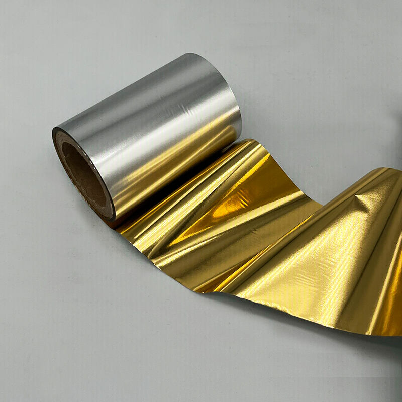
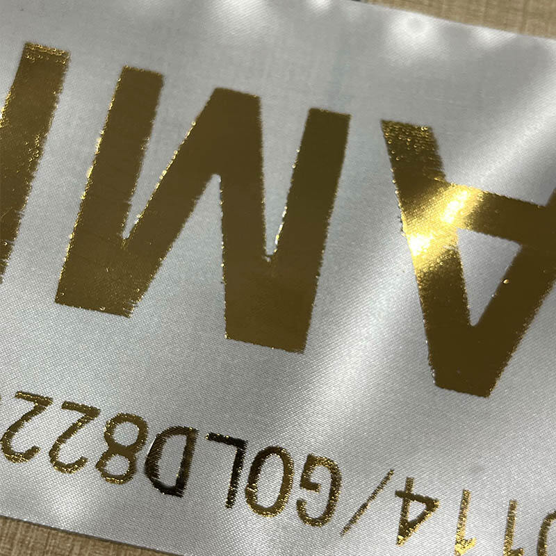
The customer used dark blue satin with a metallic gold logo, aiming for an understated yet luxurious effect. But the first batch was clearly disappointing: the gold looked dull and flat, lacking the metallic reflection it should have. It looked passable from far away, but up close, it lost all refinement.
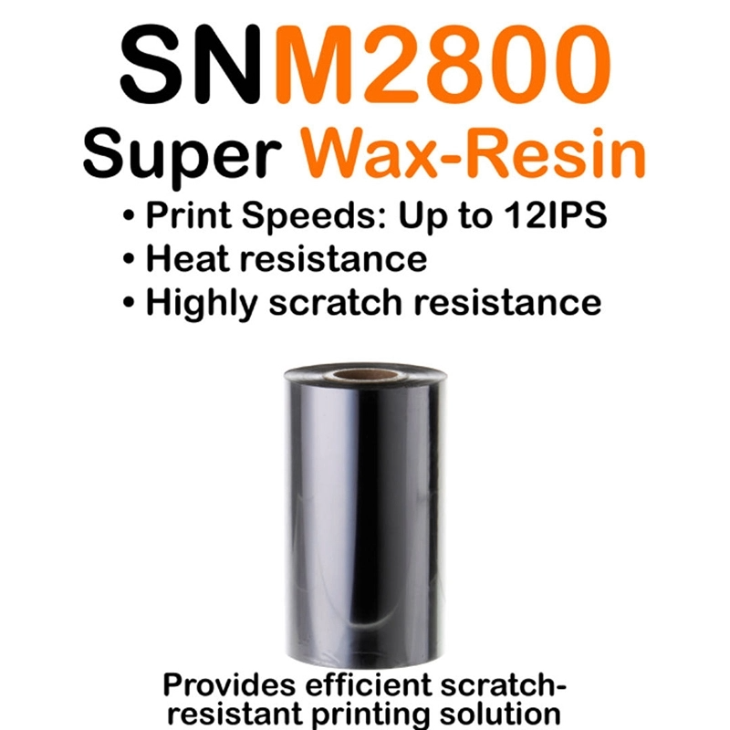
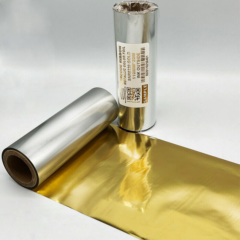
They tried adjusting machine settings—temperature, pressure, speed—but improvements were minimal. Only after switching the thermal ribbon did the result truly change.
When the new samples came out, the first thing everyone noticed was the brightness.
This “brightness” was not just lighter or whiter—it had a distinct metallic reflectivity. As the viewing angle changed, the logo showed a subtle flow of luster, appearing more three‑dimensional against the blue satin.
By then, the answer was clear.
Why do some labels look brighter?
Not because of the color itself, but because of:
how completely the ink transfers, and
how well the pigment actually adheres to the material.
During thermal transfer, the ribbon’s pigment must be fully melted and evenly bonded to the surface.
This difference is especially obvious on textured materials like satin.
When transfer is complete and uniform, metallic pigments form a continuous reflective layer. What you see is no longer just a “color,” but a material—one that shifts gently in brightness with light.
If transfer is poor, even the best metallic design will only look like ordinary ink.
After using Sinoco thermal ribbons, the customer achieved stable, predictable results:
brighter metallic gold, more natural gloss, intact details, and a clean, premium finish.
The same design, with different transfer quality, delivers completely different levels of texture.
Often we think we are comparing “colors.”
But the real difference lies in whether the color is truly brought to life.
If you have unique needs, please contact us